Case Study
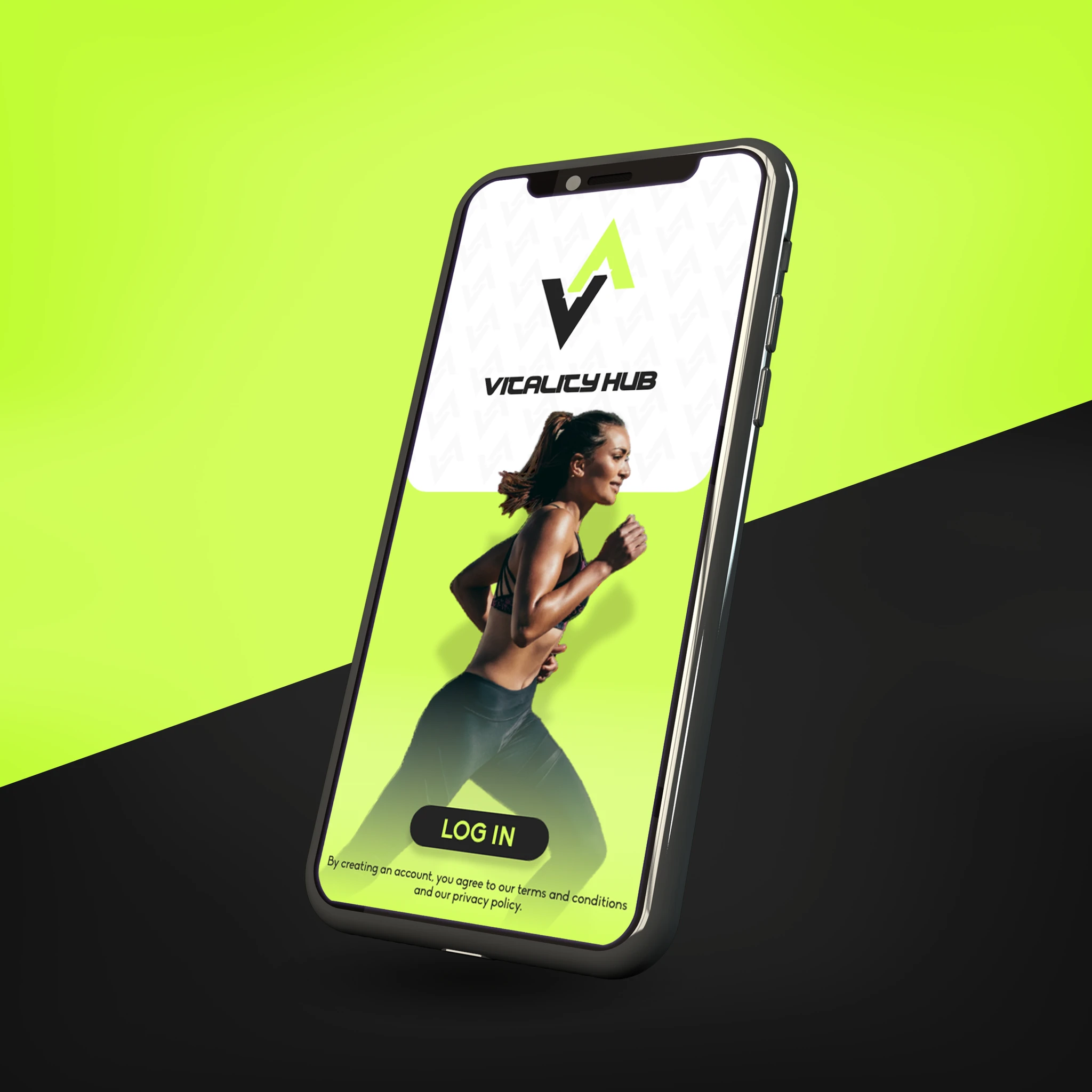
Creating an energetic brand identity and mobile app prototype for a fitness platform that empowers individuals to achieve their health goals.
Client
Vitality Hub
Year
2023
Services
Branding · Logo Design · App Prototype
Industry
Fitness / Wellness
The Challenge
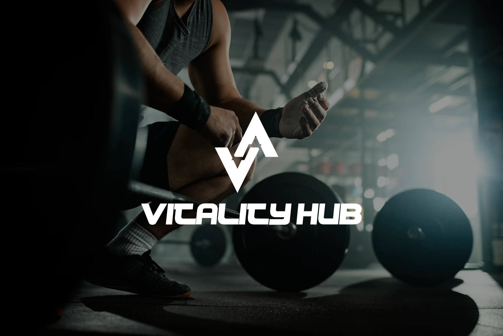
The fitness industry is saturated with brands that either feel intimidating or generic. Vitality Hub needed a brand that projected energy and motivation while remaining welcoming—a visual identity that reflected real progress, not just performance.
The Solution
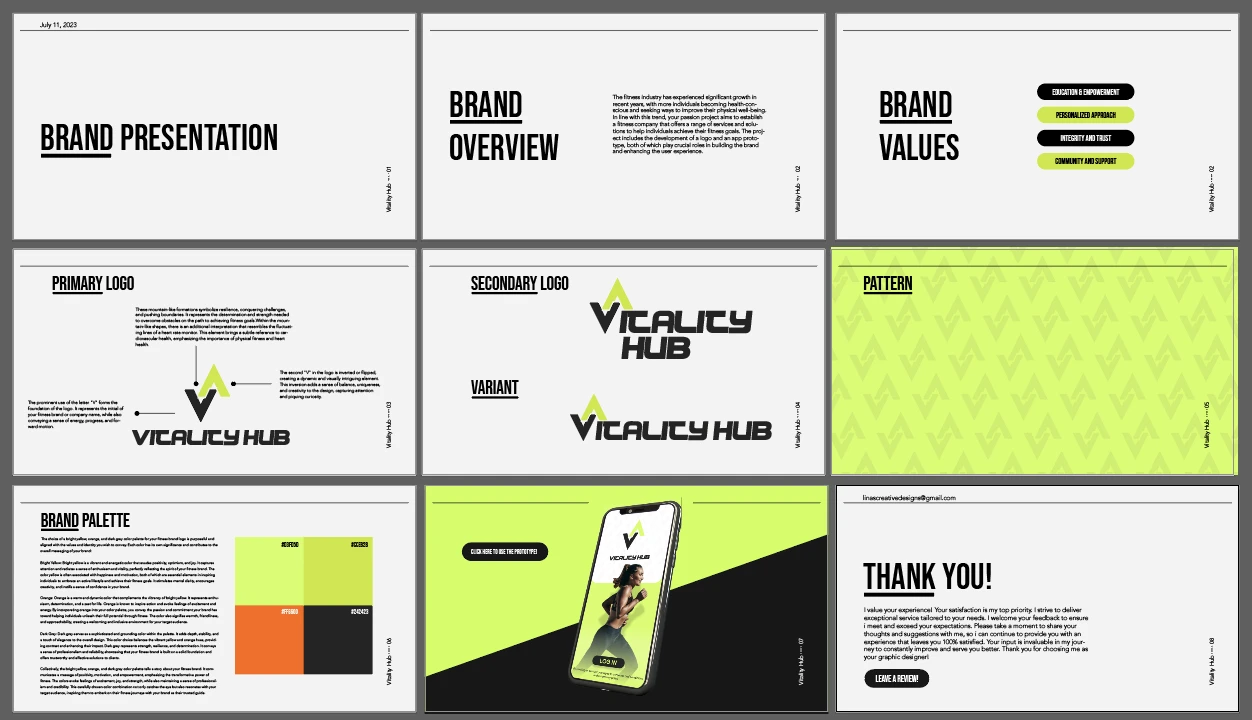
A dynamic 'V' logo built from mountain peaks and heart rate rhythm creates immediate associations with vitality and movement. A yellow-orange palette energizes without alienating—bold enough to stand out, warm enough to invite.
Brand System
Typography
A bold, geometric sans-serif system selected for its high legibility at small sizes and commanding presence at display scale—built for app interfaces and marketing alike.
Color Palette
High-energy yellows and warm oranges anchor a deep charcoal neutral—creating contrast that commands attention in digital interfaces and print collateral.
Brand Values
Every brand touchpoint reinforces the idea that knowledge is the foundation of lasting fitness. Designed to guide, not gatekeep.
No one-size-fits-all. The visual identity system flexes to support individual journeys while maintaining a cohesive brand voice.
Clean, honest design signals the same values Vitality Hub brings to its fitness philosophy—no gimmicks, just results.
The warm palette and approachable typography create a brand that feels like a community—not a competition.
Project Deliverables
The fitness industry needed a brand that speaks to motivation and progress without intimidation.
Brand Designer — Vitality Hub Project
Book your Clarity Session and let's turn your ideas into momentum.
or send a quick message